

Hi stylish people!
Together with a friend, we're starting a European based cycling brand, "unmarked", built around a few pillars:
– No logos / loud branding on the products
– Focus on aero and high-performance gear (skinsuit, aero socks, aero shoecovers) at a reasonable price
– High-quality and Made in Italy stamp
– Original designs and colorways, not necessarily loud but parting from the typical "beige/light gray" of most premium brands
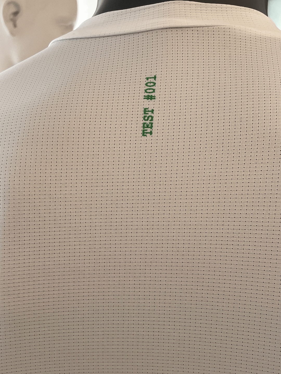
We've tested the quality of several manufacturers and have shortlisted 3, which have started to work on our first custom design prototypes.
What you see in the pictures is the first prototype, and here come the questions:
– What do you think about the concept and brand vision?
– Any feedback on the prototype?
– Is this something you would be interested in?
Thanks folks, any input is very welcome!
by dahellamidoing
19 Comments
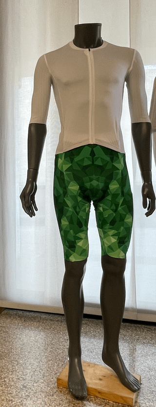
Making cycling clothing that caters to people who fit like the mannequin is a mistake IMO. People don’t want another brand of high performance/aero clothing made by some contract manufacturer.
What is the problem that you’re trying to solve? No pastels or big, loud branding isn’t really revolutionary.
Also, what is your distribution channel going to look like? Online? Do you know that around 30% of online clothing orders are returned?
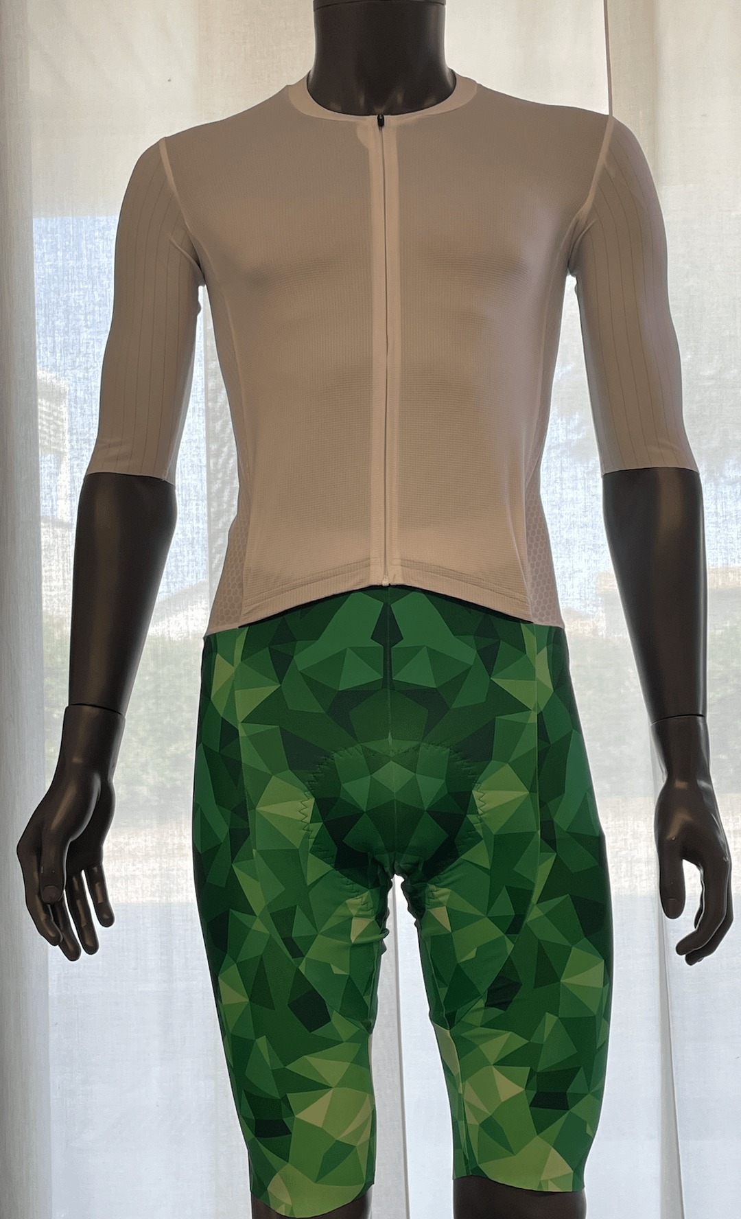
1. Shorts too long
2. Looks like everything else
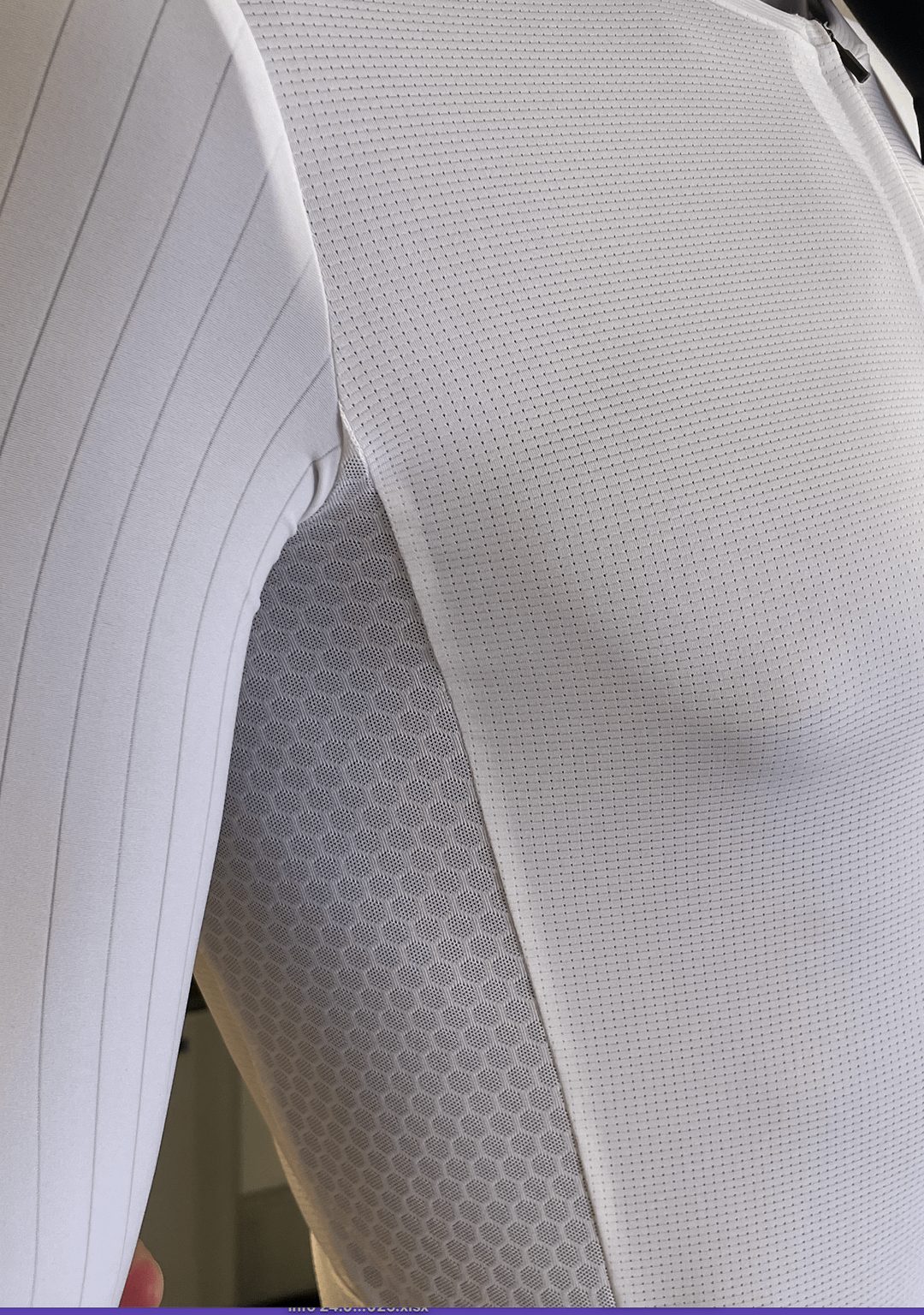
Honestly, I’m only interested in how well it fits and how it performs out on the road. Although just by the images, the wrinkles by the inner thighs and the sleeves past the elbows would make me think it is going to chafe.
Shorts pattern would look better on the jersey and the bibs being a more neutral color. This design draws the attention at the wrong spot.
What brand vision? « No logo » is not a brand identity. You still need to develop a concept and brand identity. When I look at your jersey, it looks more like a blank canvas than an actual design. Also there is zero cohesion with the shorts design.
Look at « No Name » products in Canada, for example. While they’re a discount brand with no brand logos, they still have a cohesive brand identity.
Is it UPF? If it’s boring white it needs to be reasonably priced and extremely functional.
As a potential target audience member, I wouldn’t buy it no matter the price. Assuming the functionality and comfort are spot on, I just think it’s aesthetically unattractive. I’m not sure whether the pieces in the photo are supposed to be a part of one kit, but they look like they don’t belong together. In addition to that, the white jersey is too plain, and the polygonal bibs are too much.
Good luck! It’s a fiercely competitive market. I had a friend who started a brand and found it incredibly difficult to get established. Hope you have a solid USP and a focus on quality.
I like the funky bib!
I love the bib design!
Shirt needs to be more sheer imo
Give me a set and I’ll try it lol bibs do look long though
Sleeves are ridiculously long. I can already feel them bunching up around my elbow.
No branding. Yet it’ll cost like friggin 200 for Jersey and 280 for bibs. Not revolutionary. And anything below that cost is already available. Tons for brands that offer no branding for low cost. Not sure what else can be done with cycling clothing honestly. Sorry.
How much? Free international shipping?
I like simplicity… that geometric pattern keeps bringing my eyes to the crotch way more than is comfortable. Also maybe find a few other mannequins with other proportions.
Am I the only one to see the head of a monkey in the bib?
Bib too long and difficult to pair with other jerseys’ colors (maybe light orange?). How do the back pockets look like?
Some branding is good imo
shorts pattern looks like womens clothing from large big box stores.
If you’re making aero fit jerseys they need to fit when in an aero position on the bike, it’s not really helpful to critique the fit on a mannequin standing up. Typically you want to make sure the shoulders of the jersey are designed for arms forward in a “hands on the hoods, forearms of the top of the bars” position, and the front should be shorter than the back at the waist hem so the material doesnt bunch up when bending forwards. Based on the photos the fit seems fine but maybe the arms are a bit long.
Other than that it looks like it fits nicely but without any graphics or logos I’m not seeing a compelling reason to get this over a million other competitors. Siroko makes a SRX jersey that looks similar, if you can’t beat them on price you should consider why else someone would buy this jersey over Decathlon, Rapha core, etc. If you’re aiming for the MAAP/PNS/UC kind of crowd your graphics, colours, and overall vibes need to do the heavy lifting. If this is just a blank test kit then fine, looking forqard to seeing what you come up with, although to be honest the shorts aren’t doing it for me.