
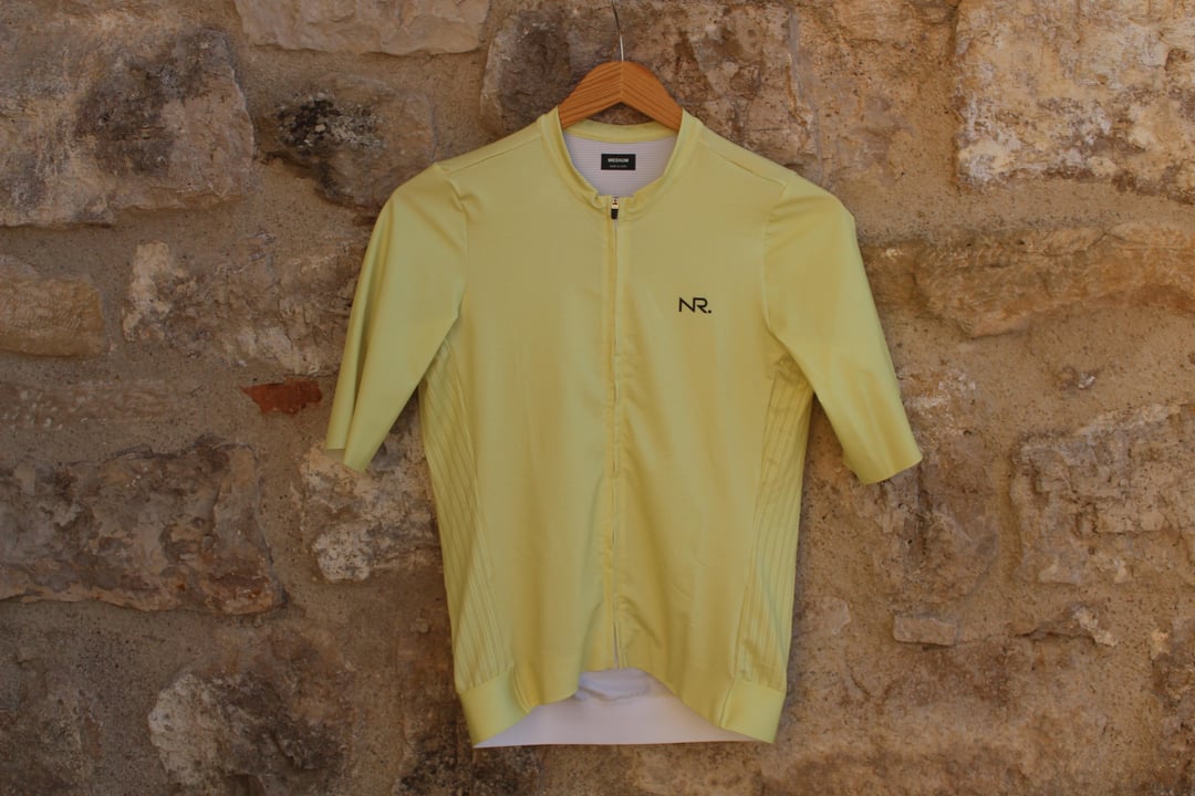
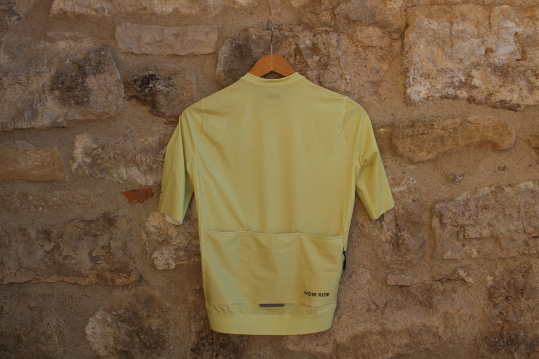
Estamos trabajando en una marca de ropa ciclista de alta gama y acabamos de recibir nuestra primera muestra.
Buscamos opiniones sinceras de ciclistas:
- ¿Cuál es tu primera impresión?
- ¿Qué te parece el color?
- ¿Te la pondrías?
Agradecemos cualquier comentario sobre la marca y la estética general.
ig: noirrideofficial
by noirride
18 Comments
I’ve never seen something like that
For the price of Van Rysel I could see me wearing that. But wouldnt pay premium prices for any new Brand
Beautiful
Nice color, bland overall and would not pay premium prices unless it had a ton of verifiable aero claims
The logo feels a little bit dated and feels disconnected from a design perspective from the full name on the back, perhaps there is a concept here that could be more creatively expressed? It’s probably the low res nature of the photo, but the materials don’t read as “premium” as they are currently showing up here – what is it that you’re using? Yellow isn’t my thing, but that’s totally subjective.
Pluses:
– looks well made
– long short sleeves
– zipper for a back pocket
Minuses:
– not a big fan of pastel colors, but they are trendy
– Noir Ride? Strange name that sounds neither French nor English
What sets it apart from the 200 other places I can get a monochrome jersey?
Make it all black put antifascist stuff on it and don’t forget some people have bellies. XXL should fit like XXL not S. Then you have a client.
Neither NR nor Noir Ride feels particularly memorable to me. I tend to associate abbreviated names like NR with more functional brands (FSA, BBB, ) rather than premium apparel brands. Noir Ride is better, but it still doesn’t really stand out or roll off the tongue.
Noir Ride isnt correct in french if you ask me. we use the word “ride” in french (french canada) but its une ride. Feminine. So it would be Noire Ride if it makes sense?
I dont think you can ask premium price when you are unknow. The fabric looks normal, not premium like Santini or Castelli premium ones.
the front zipper, i prefer it being protected from touching your neck directly.
Color is ok, wouldnt fit with my bike color or scheme so wouldnt buy but what I find missing in the market are jerseys like Givelo or the Maap one with letterings
Where is this made?
It doesn’t look bad, but it also isn’t screaming “wear me.” I like a zippered pocket, and it is giving me a throwback bowling shirt vibe, which is not a bad thing. Would I wear it? Depends on the price and features. I wouldn’t wear that color, but I probably would wear other pastel colors.
price point?
Una pregunta más para todos:
Si este mismo maillot estuviera disponible en otros colores, ¿cuáles os interesarían más?
* Negro
* Blanco
* Gris piedra
* Azul marino
* Verde oliva
* Otro
Tengo curiosidad por ver qué elegiría realmente la gent
Está chulo. El color es bonito y el tejido parece no estar mal. No un etxeondo, que para mí es la marca que mayor calidad ofrece, pero no es un AliExpress. Pero la marca… Noir Ride. Yo personalmente estoy super cansado del rollo este de café de especialidad y maillots minimalistas con este tipo de marcas que personalmente me suenan muy pedantes. Lo veo como el típico maillot “quiero ser PAS” pero no puedo y valgo 55€.
Cute. How much is it?
The logo font is too thin, looks kinda cheap, first thing I thought is that it’s gonna peel of fast, no disrespect
The written logo on the back doesn’t add anything valuable, on the contrary it adds too much visual weight to the right with the zipper pocket on the same side, maybe move the logo to the center pocket
You should actually take photos of someone wearing it to get some proper feedback on fitting and visual, it’s hardy to judge hanged on the wall, fitting is a crucial part of cycling clothes
That’s my take from a former designer
Zzzzzzzzz