
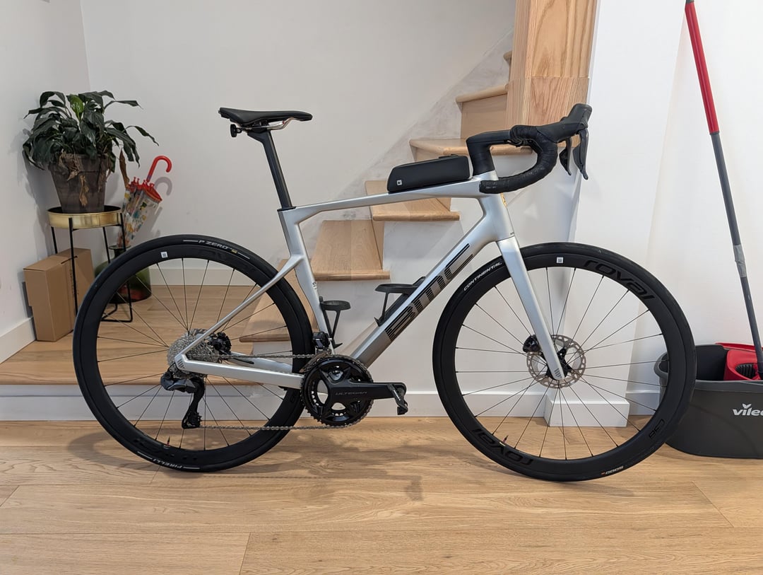
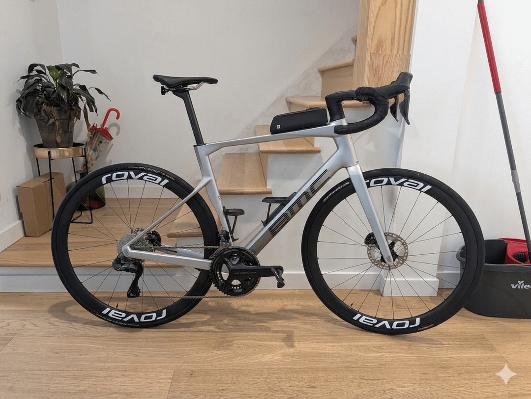
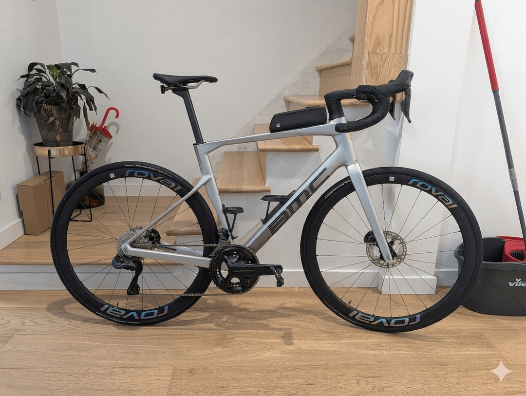
Hi all. I am trying to get some feedback on my idea to get custom decals for my Roval C38 wheels. I hesitate between keeping them black (glossy black on satin black), or white like the pros, or Chromatic silver – which would more or less fit with the bike color.
I love them three. What's your advice on this ?
by mentor_legion
12 Comments
I find loud wheel logos gauche. They pros have white logs since they’re sponsored by them. I would keep the original logos.
Chromatic is really nice with the silver frame but it’s a nice frame so leaving them black is also nice. White meh
Black is nice. Focuses the attention onto the frame.
Chromatic compliments the frame.
White, makes it a little busy and now highlights the frame and the wheels
Neither of the 3 are bad, it’s just whatever you’re wanting to accentuate the most.
Chromatic > Black > White
Silver to match the frame.
Or keep it black.
Chromatic 🫰🏼
You bike looked 100000 times better with white letters for me. Insane diference
Chromatic all the way. Like many others, I hate white letters on wheels. Looks so busy, especially at speed. The chrome is just enough pop without being disruptive to the frame, and added benefit is your wheels shine when at speed ✨
All three look good. Personal preference.
chromatic for sure
white EVERY DAMN TIME
White, that’s it. Chromatic was OK. Busy?? on a BMC bike? aka one of the least busy and most boring (not in a bad way) bike?? cmon. CyclingFashion is such a fucking joke.