
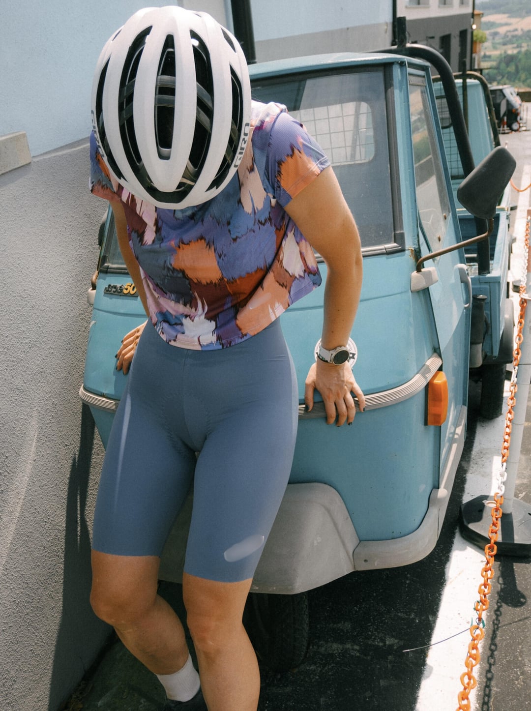
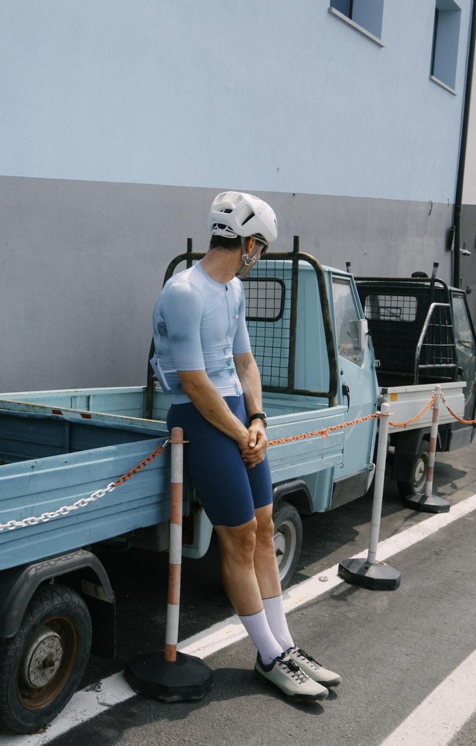
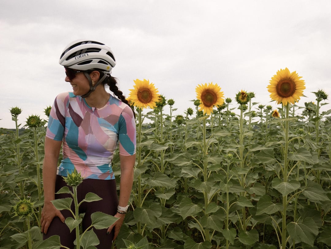
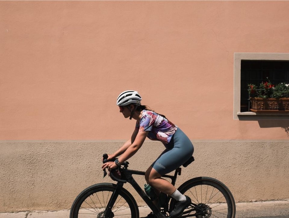
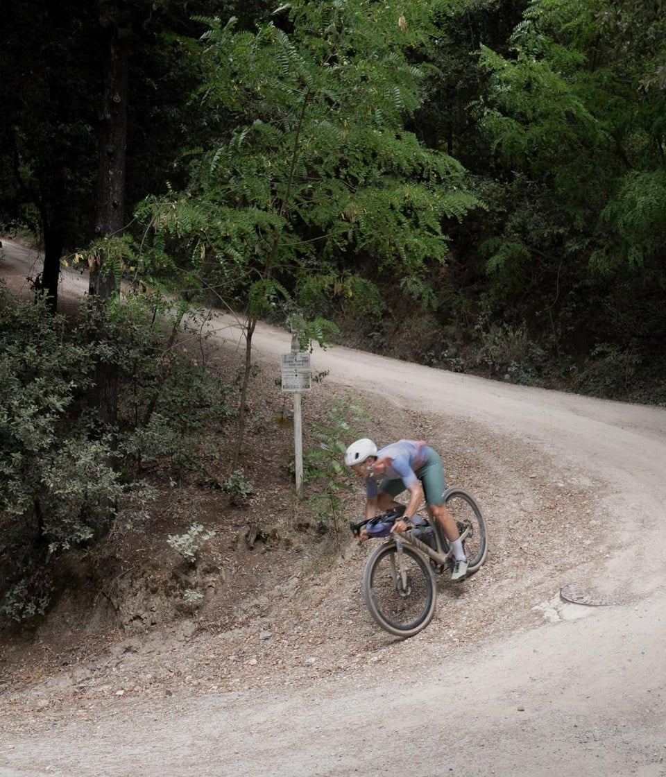
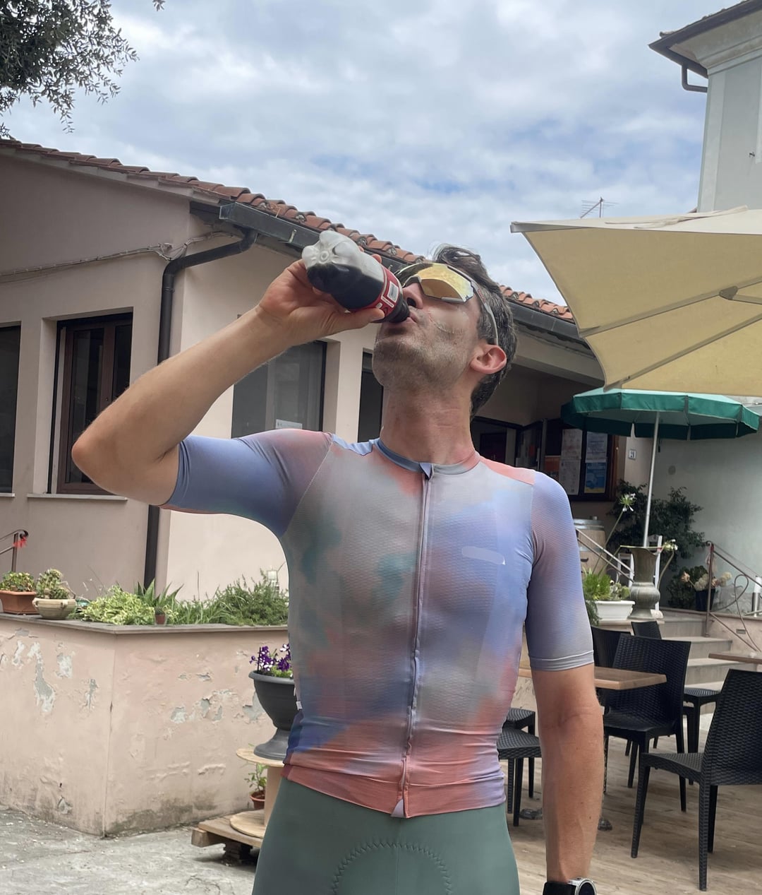
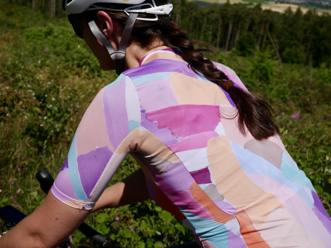
I’ve been working on building a cycling clothing brand for over a year, and I’m getting close to being ready to launch. Here you can see some of the latest prototypes. Not perfect yet, but close.
I decided to start because after years of riding, I struggled to find kit I truly liked. I wanted something bold without being flashy, and elegant without being boring that had a great fit. I wanted to create something for people who love cycling and do it for fun, and don’t take themselves too seriously, whether racing or on a coffee ride.
Before I launch, I wanted to come here and ask for your honest feedback. Would you wear this, or someone you know if it’s not your style? Does it stand out, in a good or bad way?
I’m still learning and refining before launch, and insight from people in this community who care about cycling fashion as much as I do means a lot. Thanks in advance!
by mendialde
27 Comments
We really don‘t need another cycling clothing brand. Sorry.
V-cut
They look Amazing. Great color sense and pallette. Go for it.
I dig it. a few of them remind me of muslin backgrounds and paint brush swipes.
I did the same thing, I designed my own kit because I wasn’t seeing anything I liked. Your designs are pretty good, somewhat safe in my opinion. They somewhat blend into the other looks in the cycling scene.
Colours are good. Neckline is too high for my taste though and the sleeves look a bit short
The designs are nice, and match your intent. They’re not for me personally, but no doubt there’s a market for more refined organic designs like these. Though, from a critical pov, I feel like I’ve seen versions of these from brands like pas, isadore, etc.
I’ll just say it, cause there’s been a lot of upstart kit companies who are relying on patterns and colour combos to sell their products, but what makes your product different in terms of fit or function (since you brought it up)?
I’m glad that you have some color / fun elements in your jersey design… I’m frankly getting a bit bored of plain pastel / earth tones solid jerseys
Really beautiful colors and patterns.
As a female, I ONLY buy bibs now that have drop tail to make bathroom breaks easy. In my mind there’s no excuse not to make bibs like that now. I can’t tell if these are like that or not. But I do love that color blue.
I would say these designs don’t feel wildly different from brands like Isadore and Velocio (who does really similar patterns).
First pic is…. Eye catching
Love the pastel colours and clean looks, especially the colour of the bibs!
The light blue is nice! The mixed colors are also nice. If you can get darker hue mixed colors for those that just can’t have light colors on their jerseys, that would be nice too. Don’t mind the Debbie Downer characters discouraging you from launching your line! They are everywhere! You shall succeed and prove them wrong!
Those colors are so clean! Hope it’s affordable!
Shorts need to be black and only black. Sorry.
They look solid, the designs are well executed imo albeit not for me, but I don’t think the designs do enough to set you apart as others have said in this thread aswell. I feel like I’ve seen this sort of design language from all kinds of brands in all kinds of places (and thats coming from someone who never even looked for it).
Great lookin’ designs OP
The first one is very unaero
Love the palette don’t love the patterns on the jerseys. I don’t love chunky shapes that try to hint towards a medium such as painting, collage, pencil etc. I think MAAP does a good job of taking patterns used in digital and graphic design and putting them on jerseys. It’s a smooth canvas that imo makes rough textures look cheap. But that’s just me! It’s why I don’t buy Samsara especially considering how expensive jerseys are.
I’m into it!
Designs are decent. Can you produce at Maap/PNS etc like made in Portugal quality and have lower prices than them? If you deliver great quality, decent design and lower prices, im in. Otherwise..
Lightly coloured spandex shorts are awful, just end up with crotch sweat lines
I sent you a dm on it. I wish you the best of luck on it
I struggle to find sustainable cycling clothing I want to buy. If you can incorporate sustainability from the onset I would be interested. If it’s more virgin materials etc I won’t bother
Honestly, best I’ve seen in a few years. Great job.
Little pastel for my taste.
And bibs are more science than fashion. Seam placement/economy, chamois engineering, leg grip, amount of compression… Good luck there.
I like it!
I think these look great! Color palette seems fairly calm, but nice tones.
The fit does raise some questions for me… I am a bit taller at 188cm. Some of the pictures show the kit, and it looks like it could be a bit longer. It may just be me.
It does look like something I would consider picking up in the store though.