
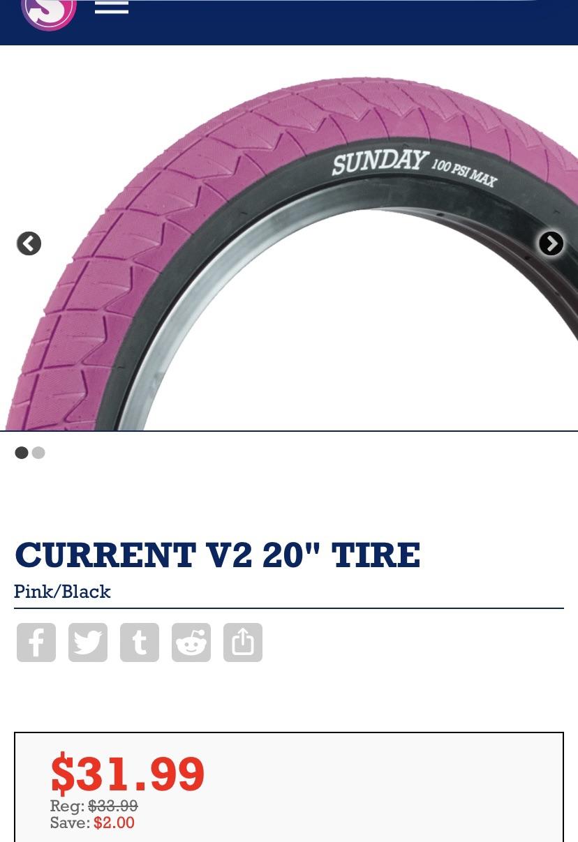
I know the description says “PINK” but I have personally seen Sunday’s “hot pink “ tires, this description I understand says “pink” /“black”, but I personally never seen these V2 tires in person before . It almost looks like a lavender purple to me. What do you guys think? I need to know for a complete I’m building.
by Solid_East_4998
5 Comments
Closer to pink, a lot of product shots for brands the white balance throws off the real colour which is usually irl darker
You can measure colour of photos on your screen, this site says that colour is pink https://www.fgruber.ch/projects/50-colorScheme/?hexColor=c8669c
But stuff does not always look exactly the same colour IRL that it does in a photo
So that’s where all those old erasers went
It’s not that grape purple if that’s what you’re talking about that’s more like a pink
Closer to pink. Imagine you take pink then add just a little bit of purple. You get this.