
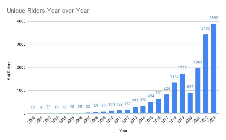
I did this analysis awhile back, hope you all find it interesting! I link to the full data as well so you can play with it as you like.
by georgeshaheen
I did this analysis awhile back, hope you all find it interesting! I link to the full data as well so you can play with it as you like.
by georgeshaheen
1 Comment
Hey there. A couple of your graphs are very strange, like a quick browse and I thought the miles .v. kilometer graph was highlighting a real difference… But it’s just a difference in conversion.
This is not an effective way to communicate data. Otherwise, I would say this is a nice and non-analytic set of charts.
Proper analysis would likely have to be done in statistical software like R, require data that can be correlated and analyzed. Which would require the deliberate collection of data, you don’t have enough here to say anything other than more people ride their bikes longer distances than previously.
Edit: Background, I’m a mathematician, and in undergrad I did statistical learning research into things like the Kepler Data and Predicative Outcomes in large data sets without dimension reduction.