
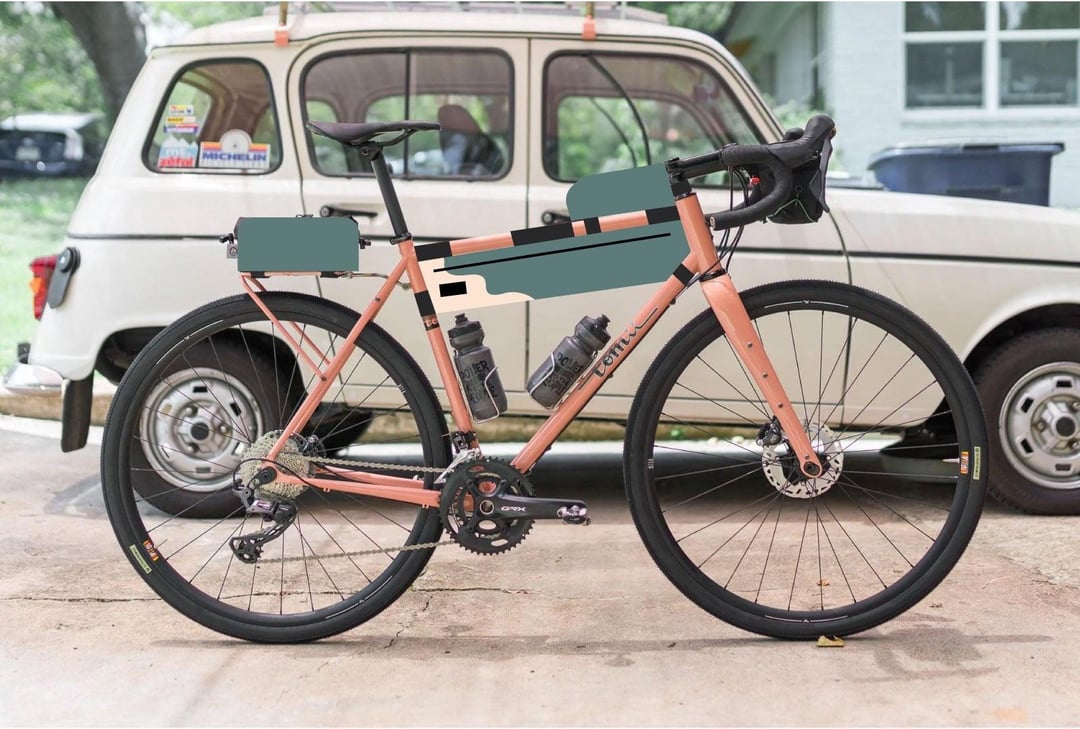
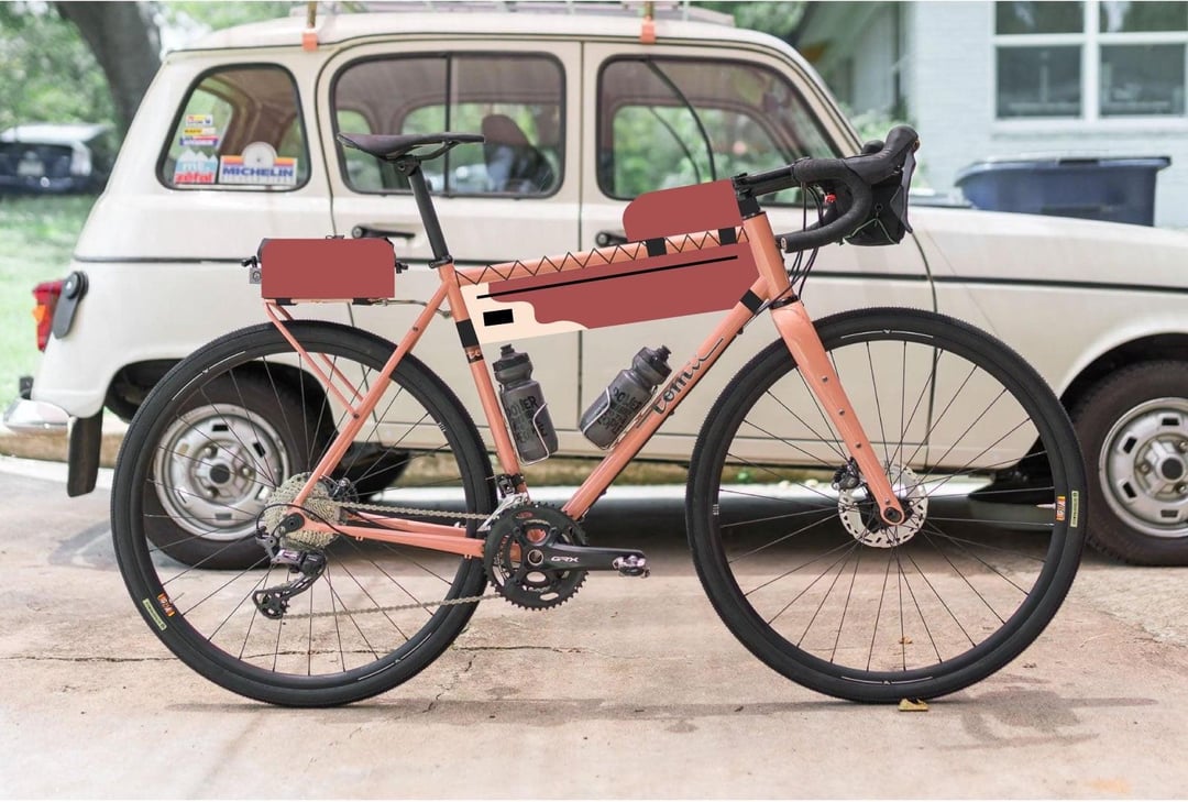
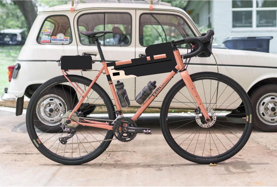
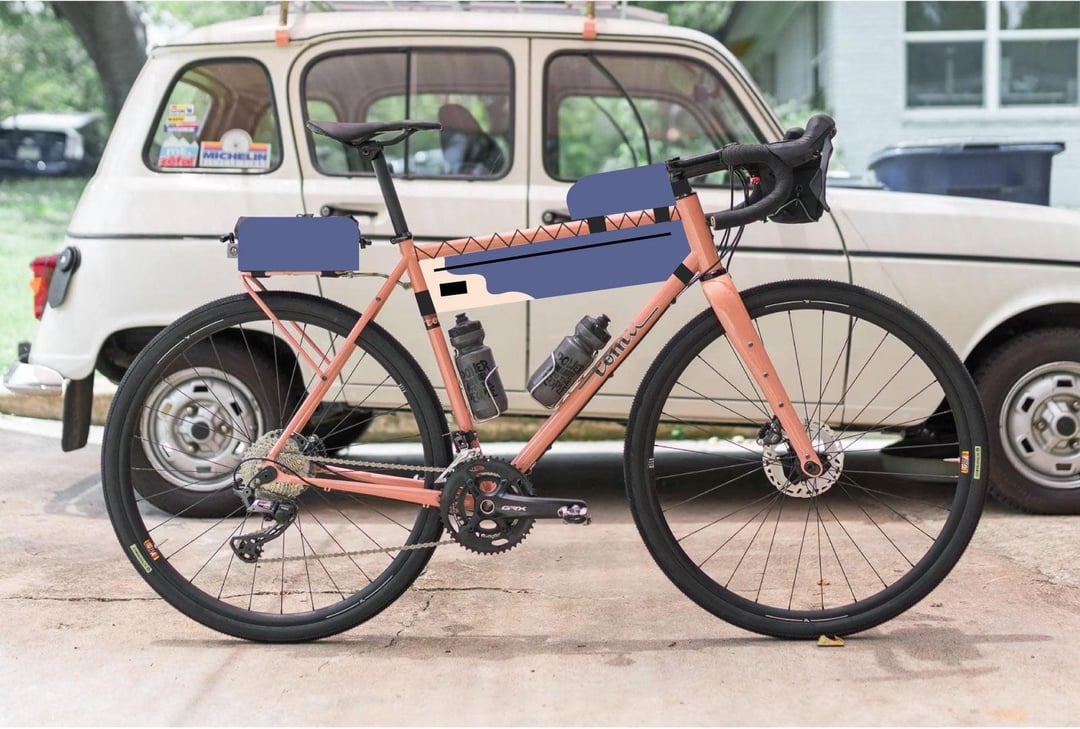
My friend who makes custom bags (Split Bags) is making me a set for my Tomii and I’m a bit stuck on color. I think I’m mostly interested in the green or red, but I’m open to opinions.
by animebike
My friend who makes custom bags (Split Bags) is making me a set for my Tomii and I’m a bit stuck on color. I think I’m mostly interested in the green or red, but I’m open to opinions.
by animebike
27 Comments
I would also choose the green bags
This sort of brick red looks good with your whatever you wanna call it frame, salmon? However as soon as it’s a different shade of red it may not be such a good match anymore, neighboring shades on the color wheel are easier to mismatch. Green, especially this teal-ish, would be a safer choice even if it’s a little off from the picture because the further the distance on the color wheel the greater the margin. Though I wouldn’t be opposed to continuing the salmon and black theme either.
3rd one looks good
Black looks best for me, matching the tires/seat/handle bar… even bottles 😉
Anything but black! I like all the others.
4, 3, 1, 2
I like the green, but have you thought about incorporating more of the cream color? My friend had a pastel pink and cream Crust and it looked absolutely gorgeous.
Go black, if in the future you decide to get fork bags or handlebars cradle/bag, saddlebags, most likely you’ll find solutions in black.
Sort of off topic but what rack is that? I’m looking for something minimalistic right now and this one looks great
Teal or terra cotta for me, in that order. That coral paint on the frame has personality. Black looks kinda basic or predictable. The blue is alright but the first two colors compliment the coral better
Use the color wheel
Teal looks the best—reminds me of an actual salmon. Red might work or it might be just enough off to look bad. Black makes the whole thing look heavy and poorly balanced—no longer playful. Blue doesn’t do it for me at all.
White, this french car looks great in white
The blue is kinda nice
green
Black or blue
Green or black
Red looks bad and clashes. Go green or black. Easy call.
I’d pick them in the order as they appear in the pictures: green > red > black > blue.
Also, I love the Renault in the background! My dad used to have one of those went I was a little kid, fun car!
I really like the blue bags, the green isn’t half bad either
I’d email Tomii and ask. That guy knows color.
Green!
aubergine
r/cyclingfashion
Green are dope
Red
Teal