
Edit: There was a bug causing Belgium and Denmark cities to be underscored, please ignore those, I am aware they are wrong!
I made a program to calculate a score for any city/municipality on OpenStreetMaps (which is almost all of them in developed countries). The score is meant to represent how possible it is to bike to places in your city without a significant amount of stress from cars and obstacles. Read my comment below for a more in-depth write up.
I'm looking for critiques/suggestions to improve my methodology and displaying of the information. Also, what other cities should I include? (I have to manually run each city, so I paused at 500 cities in case any changes are needed.) And how accurate are the scores? Particularly on cities where other bike indexes diverge from mine.
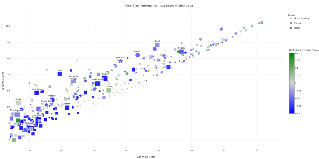
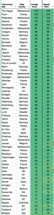
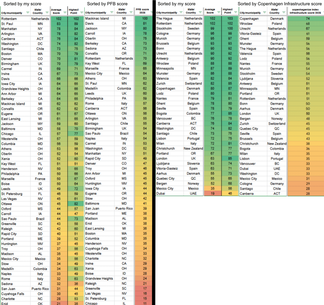
The 2 alternatives I compared to were PeopleForBikes city rankings (mostly US cities), and the Copenhagenize Index (mostly EU cities). The full list of cities that notably diverged in the rankings are in the last image, but I'll mention some notable ones here.
Note: these scores are just for the experience of living in the city proper, please do not factor in your experience living in a suburb of these cities.
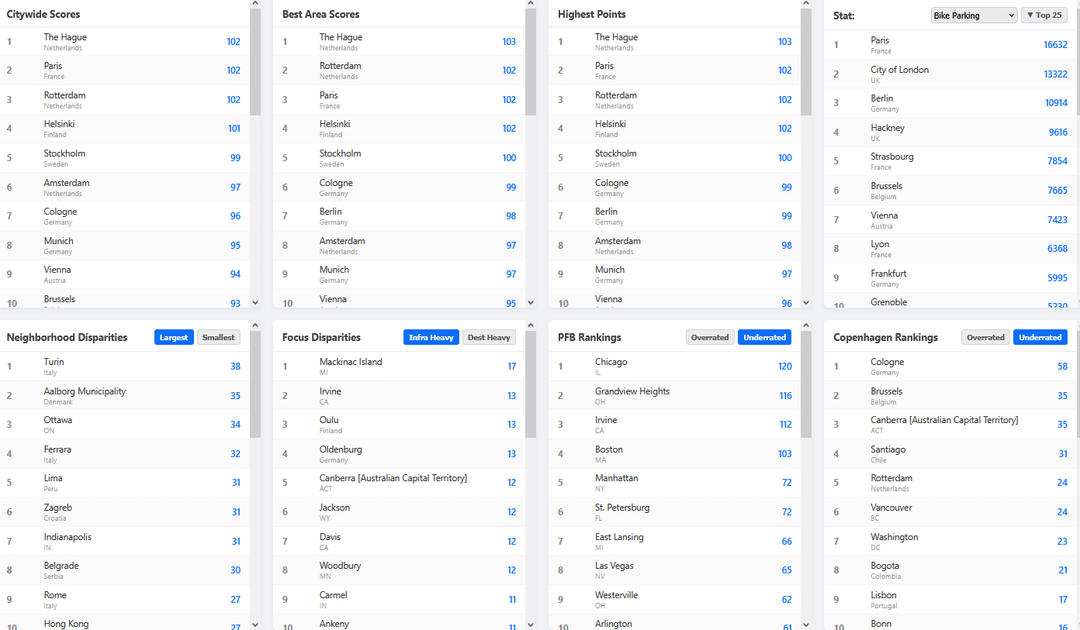
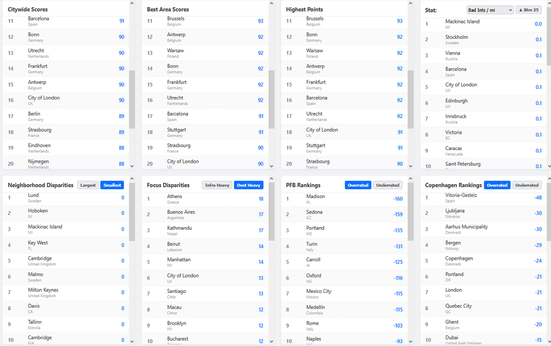
The Copenhagenize Index gives higher rankings to Ghent, Vitoria-Gasteiz, and ironically enough, Copenhagen, whereas my program gives higher rankings to Rotterdam, Cologne, and Brussels. They also gave higher rankings to Ljubljana, London, Québec City, and Bergen, while my program gives higher rankings to Bogotá. Vancouver, and Canberra. And it said Portland OR and Minneapolis are tied, when my program has Minneapolis as better.
PFB says Davis is leagues better than Irvine, but my program has them pretty similar. It gives much higher rankings to Berkeley, Corvallis, and Philadelphia, but my program prefers Arlington VA, Washington DC, Boston, and Denver. And internationally, PFB has higher rankings for São Paulo, Marseille, Mexico City, Medellín, Leeds, and Rome, while my program gives higher rankings for Canberra, Santiago, and Birmingham UK.
Thoughts? And don't forget to check out my comment if you want more info!
by Tommyblockhead20
10 Comments
**Why I made this program:**
1 Some cities have great accessibility to destinations but lack safe paths. Others have extensive infrastructure that doesn’t actually connect to where people want to go. Some cities have an incredibly bikeable downtown, while the outskirts are hostile, whereas others are merely “ok” throughout. Some cities have a ton of rural land within their borders, many only make up a small part of the overall metro area.
How do you fairly encapsulate this into a single number? There simply is no perfect way. That is why my program generates 9 scores to cover different priorities:
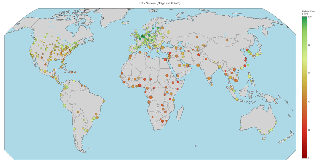
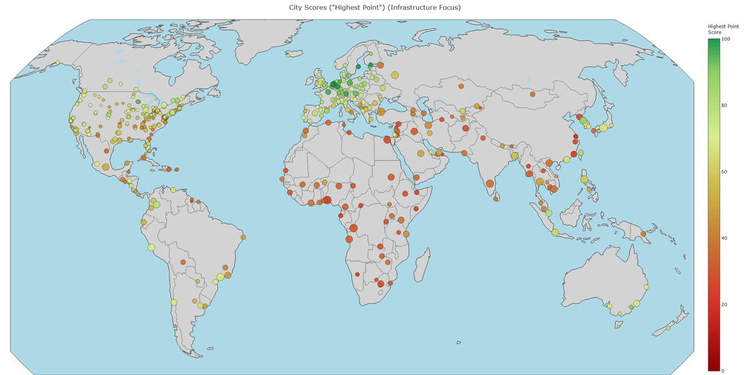
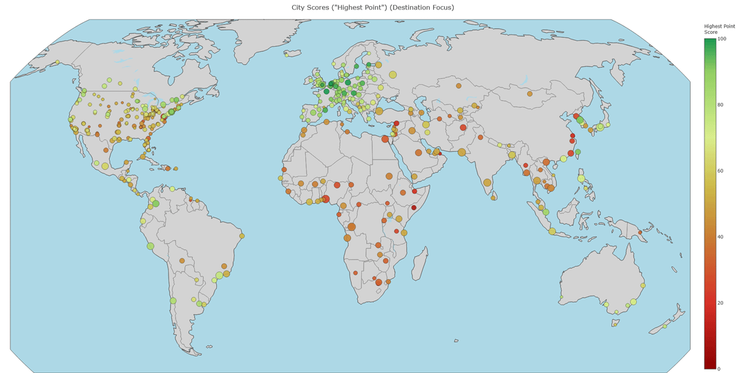
Three Weightings: Infrastructure prioritized, Destination prioritized, and Balanced.
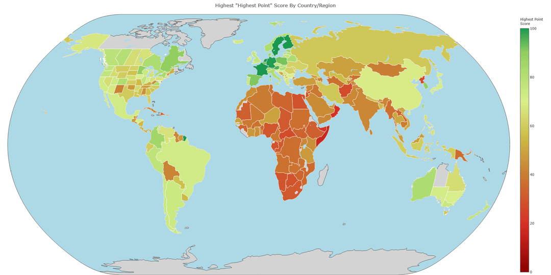
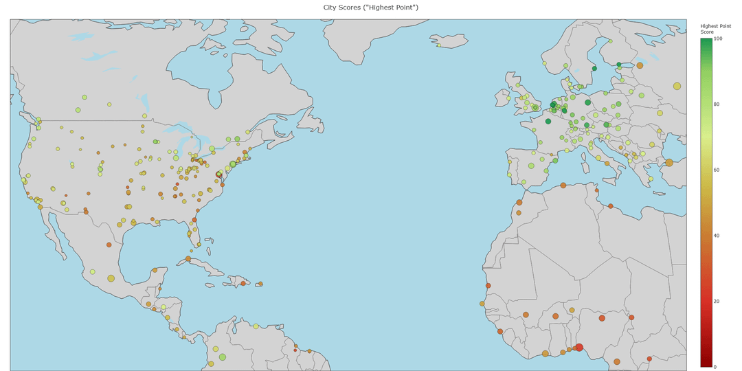
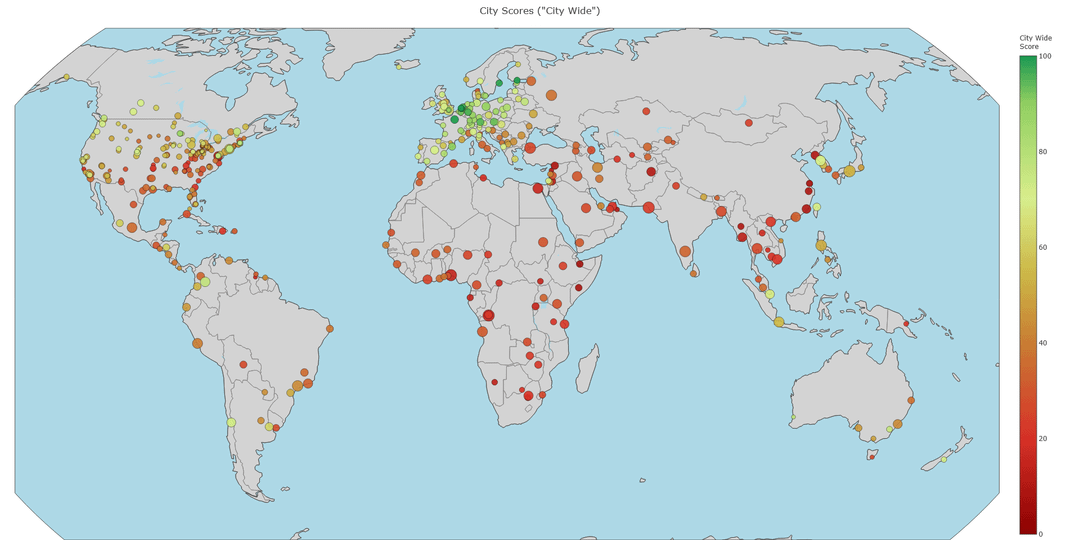
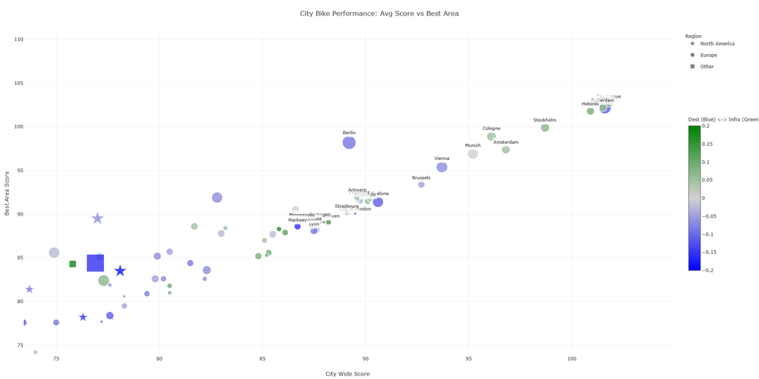
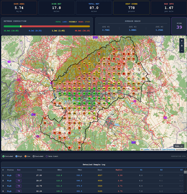
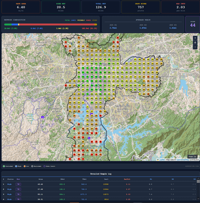
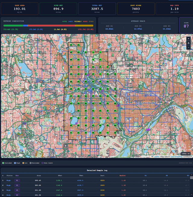
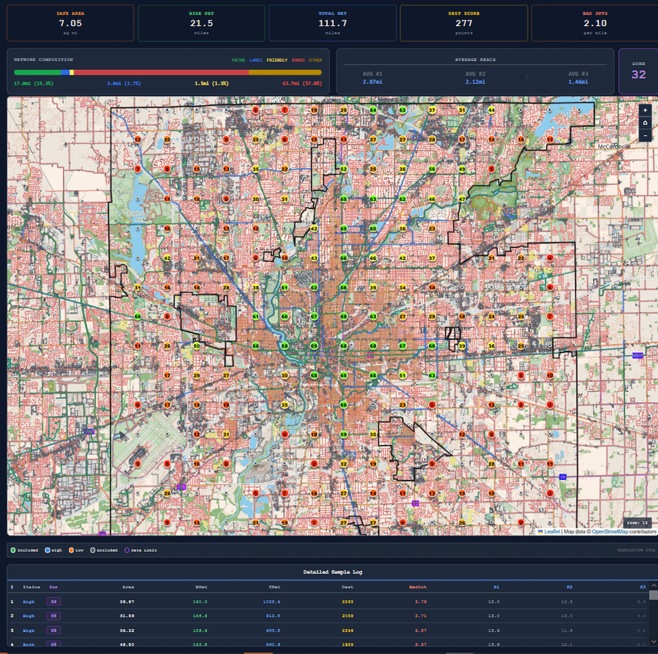
Three Scopes: A “Citywide” score (the traditional way to measure), a “Best Area” score (to highlight the most bikeable 20% of the city, useful for choosing where to move), and a “High Point” score (the 95th percentile score, IMO best for direct comparisons between cities, because it is the least biased by city borders).
2. Some bike-friendliness indexes just look at what infrastructure/destinations exist within a city’s borders (e.g., “there are 100 miles of bike lanes”). Others include a basic connectivity analysis within the city limits, but stop there, or don’t look at the infrastructure or destination access at all. My rankings are designed to more accurately reflect the experience of someone actually living in the city. The program looks specifically at the infrastructure/destinations within reach of each neighborhood, excluding hard to reach areas within city limits, and giving credit for reachable areas even if they extend outside city limits. For example, Grandview Heights (a small suburb of Columbus, Ohio) has minimal bike infrastructure within its borders, leading to a poor score from other methodologies. However, just outside its borders is a fully grade separated path that goes 2 miles south to downtown, and 10 miles north to various other suburbs and parks. IMO, that should factor into the score.
3. Some indexes look purely in terms of percentages. Like a town of 100 people having 100% bicycle infrastructure coverage is better than a city of 1,000,000 having 50% coverage. But a cyclist in the city ultimately has access to much more, so I think it should receive a higher score.
4. The main motivation for this program was that existing indexes only analyze select major cities (and select towns in the US, Germany, and France). This program can rate any boundary that exists in OpenStreetMap (OSM) that is city-sized or smaller. This allows for ratings of smaller towns and suburbs, as well as cities in countries that are often ignored.
**How the program works:**
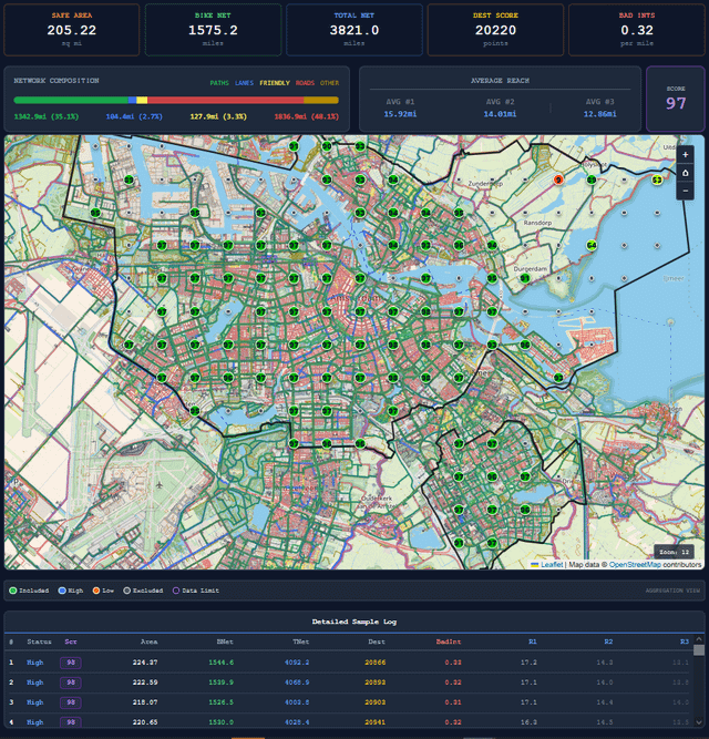
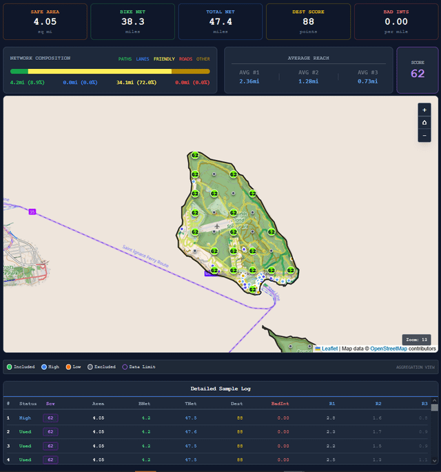
A stress score is calculated for every road, path, and intersection, with over a dozen scores possible based on tags from OSM data. Dijkstra’s algorithm is then used to calculate a network of everywhere reachable from a given starting point without exceeding the allotted amount of stress. Metrics like the total network length, the percent of it that has bike infrastructure, the destinations along the route, and how far you can get, are then added up to get a final score.
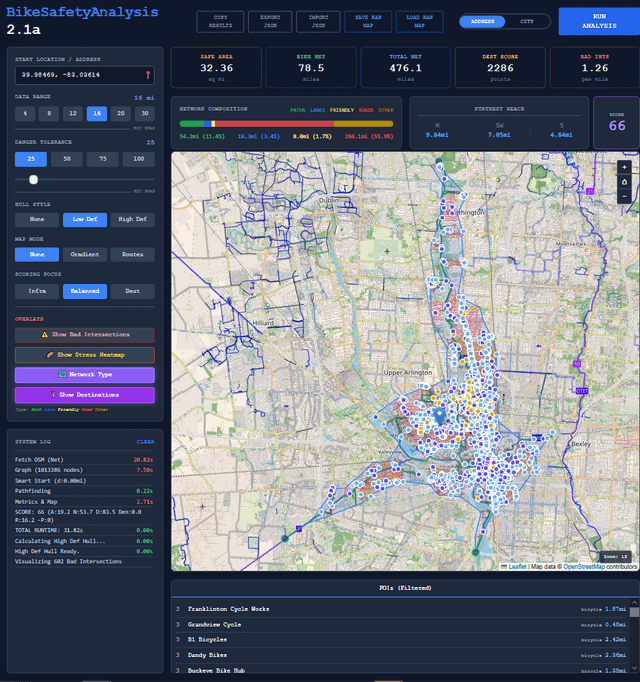
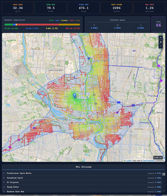
There is an Address mode to calculate for a single point. It shows the full calculated network with options for a cumulative stress view (how stressful to get there) and a branching network view (useful for showing the ideal routes to get places).
Then there is the City mode. which calculates this score for a grid of 30-300 points (depending on the city size). It has options to view the average score and metrics for all the points (excluding a few at the top and bottom due to their tendency to not be somewhere you can actually live), or to view just the best 20% of points. It also shows the individual scores and metrics for every point.
Both modes also have options to see all the dangerous intersections, the stress level of every stress/path, the type of network it is (path, bike lane, bike friendly road, and shared road), and the reachable destinations.
**Potential Limitations:**
* Data Reliance: Accurate ratings rely on OSM data completeness. For road/path types, the program checks for bicycle permissions, destinations, speed limits, and surface smoothness. When that data is missing (typically in developing countries), the program uses estimates, which can result in slight over or under estimations.
* Populated Areas: Citywide ratings are based on points distributed equally across populated areas, with no weighting by population density. This means cities with drastic differences in population density and bike-friendliness within their borders may be slightly off, likely underscored. If this concerns you, the “best area” score is great for you, as it scores just the most bike friendly neighborhoods, which usually overlap with the highest population density.
* Missing Factors: Due to there being no way to objectively collect this data for any town, government policies and bike culture/usage are excluded. For people that strongly care about those aspects, this tool works well in conjunction with other indexes for cities they actually rate.
* Weather and elevation are also excluded due to being harder to add and uncommon to see in other indexes. If people care about these, I can try to add them, at least weather.
Sorry, but as someone living in Berlin who has been to Copenhagen, and who has been to many German cities, there must be significant flaws with your methodology if it ranks Copenhagen, and Denmark as a whole, as worse than *any* place in Germany.
And Berlin better than Amsterdam? You must be kidding. Have you been there?
Love it, thanks so much for sharing!
Are you assessing bike route/lane level? That’s very fundamental to an analysis like this and I’m not sure if that data is well captured by OSM
I don’t see a link anywhere
As a cyclist in another Italian city, biking in Napoli sounds scary af
Birmingham, UK is my home city while I have also lived in Amsterdam and other European cities. I’d be interested to hear why it’s been marked up.
Canal towpaths are often marked as cycling infrastructure on maps, giving the appearance that the city has long, uninterrupted cross-city cycling routes. In reality this is not the case. The towpaths are narrow, often unpaved and overgrown. When I visit my parents I choose a six-lane A-road over the canal path as it’s just not practical.
Birmingham has had some small improvements, in recent years, but these are often unmaintained. The path along a street I use to reach the city centre there, built with temporary materials during COVID, is full of broken glass and parked cars, totally unusable.
If you’re ready to share, then why is there no link sharing it?
Brb gonna go bike across Quebec North to south because someone got misleading data for his map.
Extrapolating the best neighborhood to an entire country the size of China or Russia, as in the first image, is a bit misleading.