
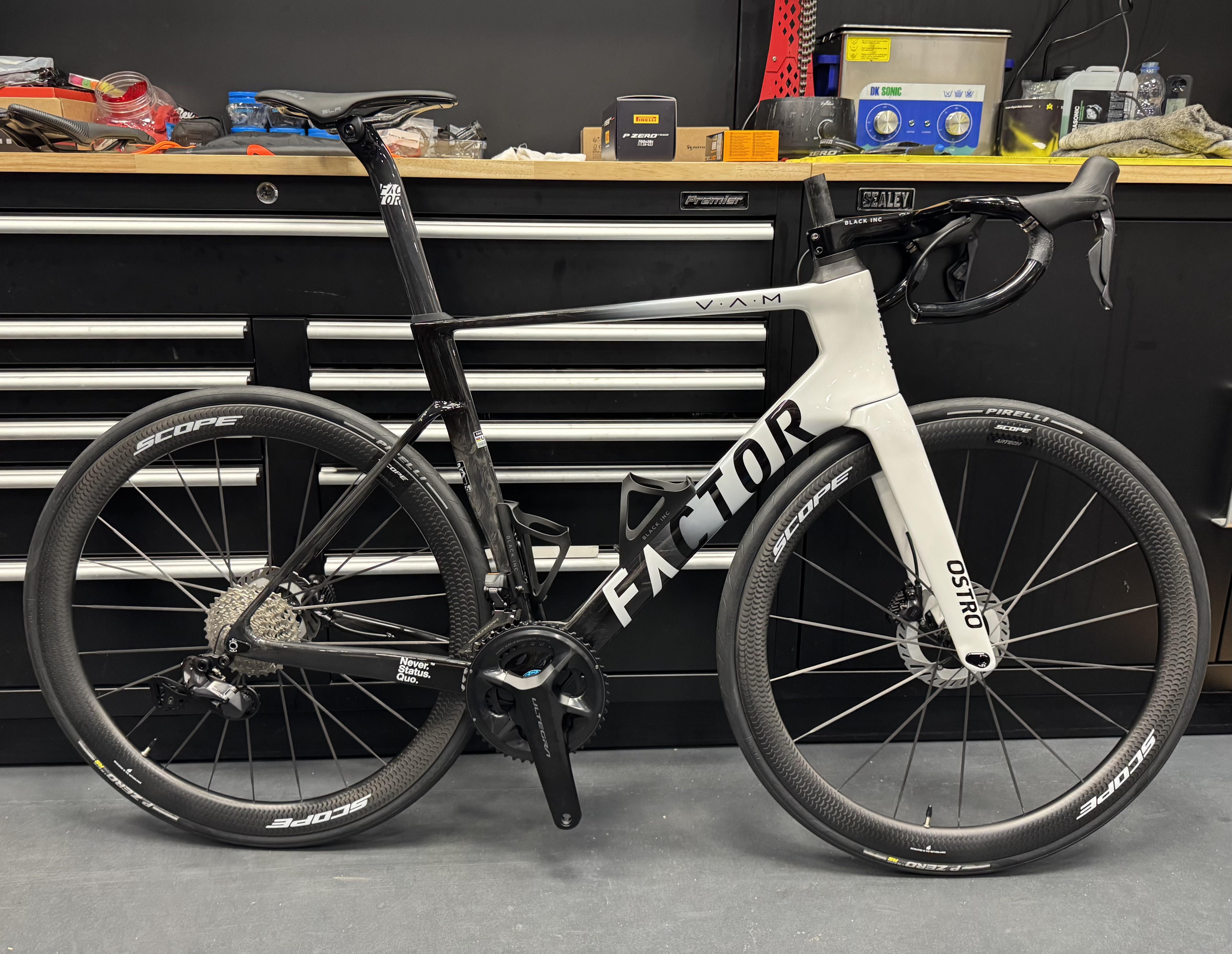
Hi all, I ordered this Ostro with a partial custom paint job (partial because it’s using Factor’s Prisma configurator).
What do you think about the main FACTOR logo?
It feels disjointed to me with the black-to-white transition due to the fade on the bottom tube. Any suggestions for what might look good? I wonder whether making the C white instead of black might help? Pretty much willing to make any change, including a full repaint if necessary, but the only rule is it must be black & white (it would naturally be better if the man logo was all grey/silver).
Thank you!
by Stagsnake
6 Comments
Maybe make all Letters of the word „Factor“ black with white outline? This way it would pop more and look cleaner
I think it’s cool. Maybe you’re overthinking it.
You could consider just white-outlining the ‘C’ ?
lol it’s already painted now. I’d just ride it
Nah its cool dude. When it’s covered in road grime and stuff it will look cool af
Silver flake the C
Looks so sick holy fuck love it