
Hey guys,
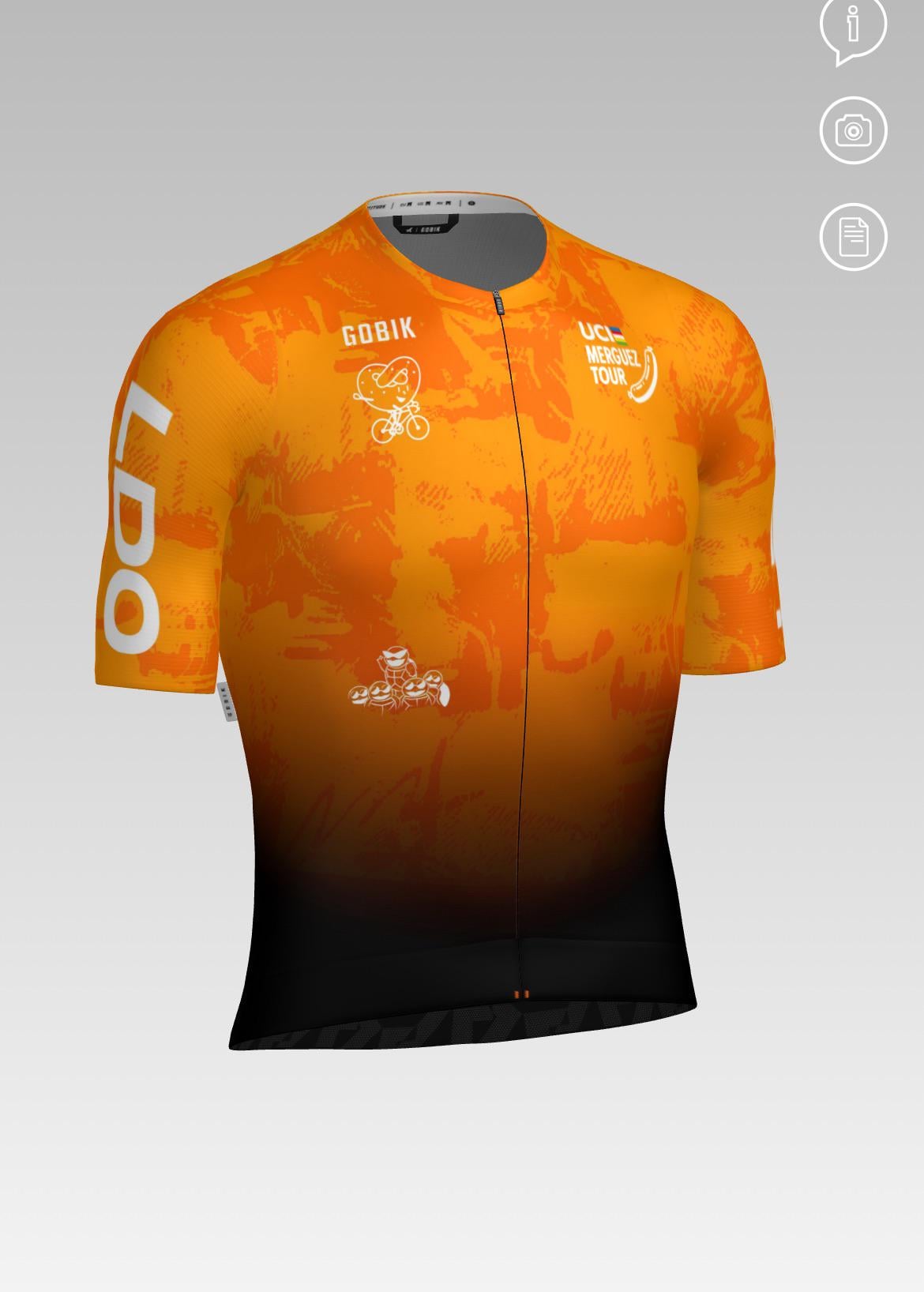
We’re finalizing a jersey for our cycling group and could use some feedback. The design is 90% set, and there’s already a large logo on the back (the same bike-riding pretzel as the one below Gobik branding), so we don’t want to repeat that on the front. However, the front currently feels a bit too empty visually. By the way, the squirtle squad logo will move towards ribs.
The group doesn’t want to put our group name (LDO) on the front again — they prefer something more subtle as it’s already present on both shoulders. We’re trying to avoid large branding twice, but still want the jersey to look balanced and intentional.
One idea was to put fake sponsor logos or subtle design elements up front (kind of like tongue-in-cheek branding), but not sure if that’s odd or a good fix.
Any ideas to make the front feel less empty without a big logo? I thought a strong all-over print woule help but it still feels empty right now.
Minimalist elements? Stripes? Patches? We’d love to hear thoughts or see examples if anyone’s tackled a similar issue.
Thanks in advance!
by Username_Raphael
4 Comments
I can’t look at this jersey without seeing an Euskaltel Euskadi logo on the front!
Hello, may I ask what website you are using to build this jersey? Thank you
I really like it. The small white icon on the left seems a bit off, though.
I would join the club for the jersey.
Remember when you are actually riding (especially in the drops) not much is visible on the front.
My only recommendation would be to move the two logos a bit further down from the shoulders. In their current position there is a good chance of the fabric being stretch and warping the logo when it’s being worn.