
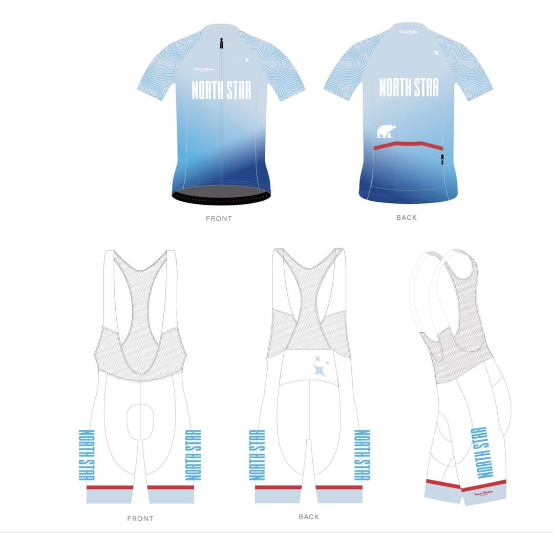
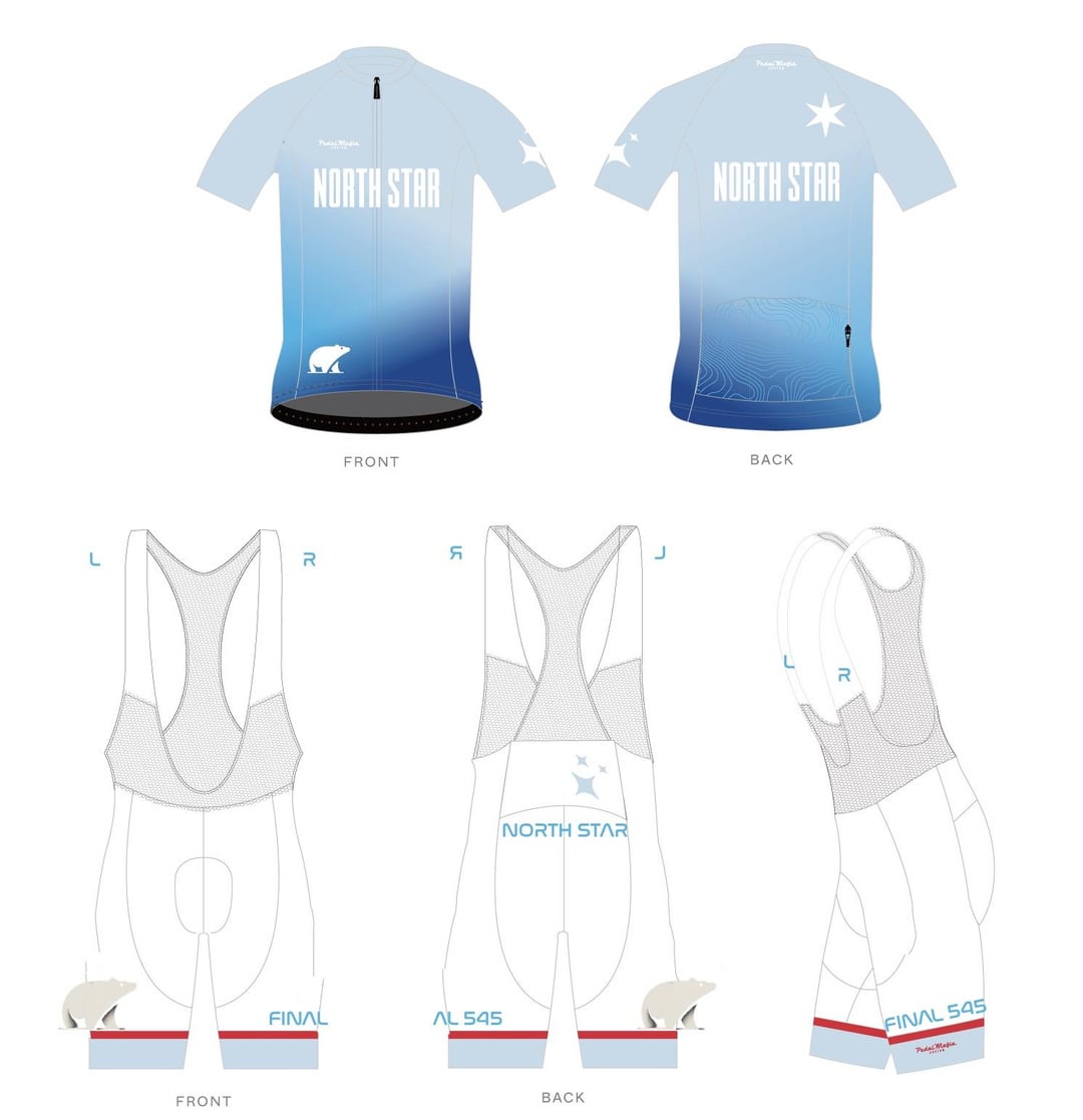
Hi hi!
I’m trying to get custom kit designed for me and my buddy for the AIDS lifecycle and I would love your feedback on what I could adjust on these designs?
Design elements
Team name. North Star
Color theme chicago flag light blue white and red
Bear and topography for California
Final 545 since this is the last aids lifecycle (our first time riding it though)
by Cyclingpup
4 Comments
White shorts are a terrible choice
I like everything but the white shorts.
You’ve done what most people don’t and kept it nice and clean.
My only advice would be to maybe make the lighter end of the gradient a bit darker or move the transition higher so the white NORTHSTAR text will be clearer. At the moment it might get a bit lost.
Black shorts for sure. Or at least a fade on them. I also don’t like that the front and the back are basically the same.
I’m not a massive fan of extreme fades (large contrast in tone) but if you like it, just make the shorts either black or dark blue (same as the bottom of the jersey).
Also put NORTHSTAR and the star emblems in the dark blue, to pop off the lighter end of the fade.
I’d also drop the red stripe. Looks out of place against the blue for me.
I’d also use the same 6 pointed star from the jersey back on the sleeve and shorts.