
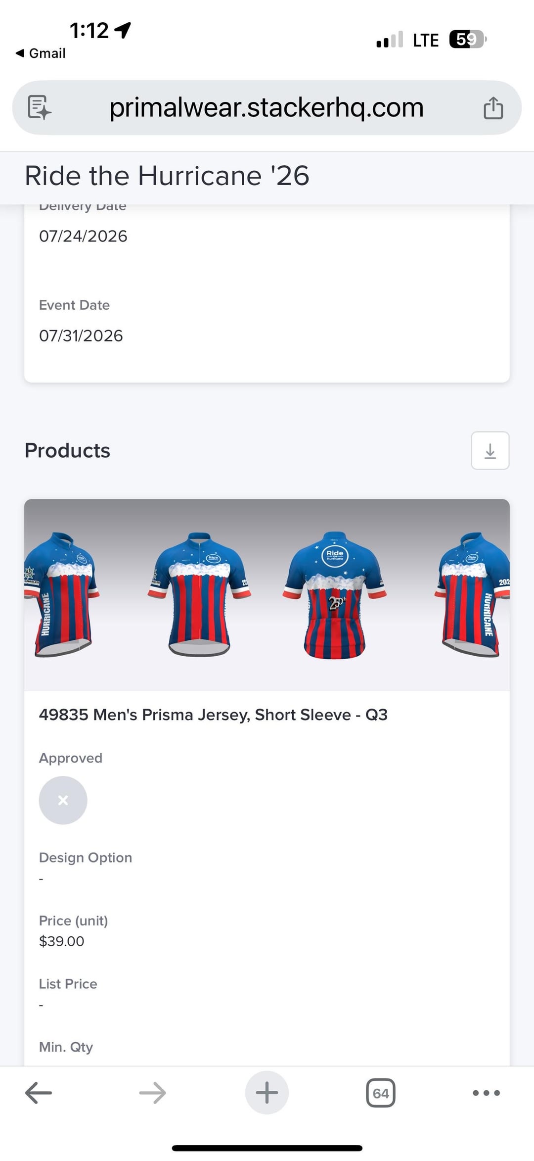


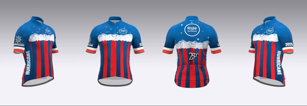
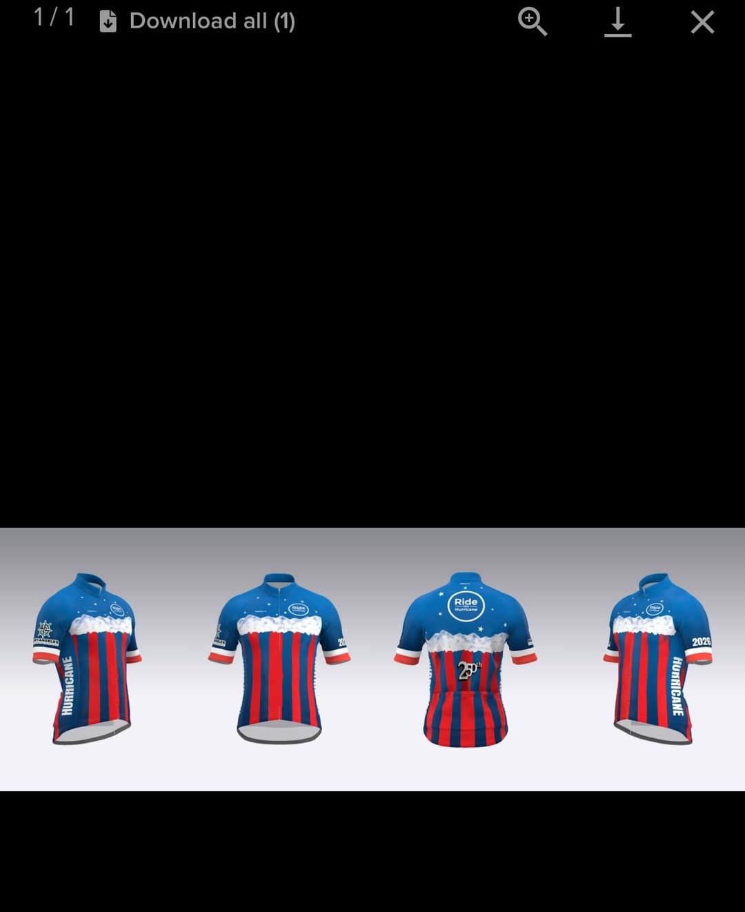
My boss wants our annual jersey to be a nod to the 250th anniversary of the U.S. It’s hard to land on a design that has flag elements or red white and blue, but doesn’t look like a Captain America costume or a team jersey. It’s a Sea to Summit ride so we usually try to make some kind of nod to that, but I’d love suggestions for something that acknowledges the anniversary without being to ‘murica, if you know what I mean. These are some of the examples after working with the jersey manufacturer design team, but they just aren’t landing. Would love some advice on how to create a 250 anniversary jersey that our mostly liberal crowd would want to wear.
by Consistent_Clue8718
2 Comments
This is a hard thing to solve, I feel like USA jerseys for sporting events like Olympics, World Cup etc even have a hard time nailing this. Honestly this year’s World Cup home jersey is one of my favorite versions I’ve seen. Isolate an element of the flag and play on variations from there. Or my personal assumption would be that you would be better off focusing on features of America rather than the flag- mountains, oceans, national parks etc. what we offer as opposed to our branding if that makes sense?
Skip the blue, make it red and white, add a maple leaf with XI for “Canada’s 11th province” that should make your boss happy